Techie Writer Reviews - 5 Reasons I Love the BookBook for iPhone 5

DSCF0139.jpg

You've probably noticed I'm a tad critical on Techie Writer Reviews even though I only write about things I use on a regular basis. What can I say? I had one of those "You got a 97%? What stopped you from getting a 100%?"-type families. Which brings me to TwelveSouth's BookBook for iPhone 5 case. I honest to goodness only have one criticism (and said complaint is partially user error). I have small hands, and not particularly strong hands, so I haven't been able to comfortably fold back the case when I want to hold the phone against my ear. This leads to somewhat comical incidents of me appearing to the world as if I'm holding an open book up to the side of my face and talking to myself. Since I don't use my iPhone much as a phone, this minor gripe is one I can overlook. Now let's get on to the 5 reasons I love this iPhone case. 

1. It looks like an old book (aka extremely cool):

DSCF0144.jpg

The number of times random strangers have asked about this case is remarkable. I've gotten everything from "Why are you walking around with a Bible?" to "Is that an iPhone case? OMG, it looks just like a book!" As you already know, some authors crave constant affirmation of their merits (myself included), even when it's a simple comment about their taste. 

2. It doubles as my wallet:

DSCF0119.jpg

As you can see, the BookBook contains just enough space for my credit cards, ATM card, ID, and a folded $20 bill. While I still possess a purse (vintage Coach, in case you're curious), this case guarantees I can walk out of my apartment after grabbing exactly 2 items–my keys and my phone. Said items fit perfectly into the pocket of my coat (but, unfortunately, not my jeans), and having my phone and wallet in a single package means I have one less thing to lose. The downside of this, of course, is the panic attack that accompanies the realization that I might have left my phone somewhere. 

3. Unimpeded access to the things that matter most:

DSCF0131.JPG

I used to not like phone cases because of the increased difficulty when it came to (a) turning on my phone (b) charging my phone (c) putting my phone on silent and (d) using the camera. The BookBook leaves all the above parts open and easily accessible. This "lack of protection" might be a turn-off for some users ("But what if my phone gets wet?"), but I consider it good design. I just need the case to provide some added protection, not save the phone from a 10 story fall into a swimming pool (they sell insurance for that).

4. The (very durable) case looks better with age:

DSCF0145.jpg

I have owned this phone for eight months. In that time, the phone has never left its case. If my husband is to be believed, I'm a certifiable phone addict. I use my phone constantly. I probably open and shut that case at least twenty times a day, and I don't do so in a particularly gentle manner. While the spine shows some wear, the leather itself is still solid, so much so that I can say with certainty the case will last at least as long as the phone. Because it's made to look like an old book to begin with, the more I use the case, the better it appears. There aren't many consumer products on the market that improve with age.

5. It matches my Macbook Air case:

IMG_0113.jpg

To be honest, I bought my Macbook case after I bought the phone case. Nonetheless, the (slightly OCD) girl in me appreciates being able to coordinate tech accessories. After all, as a writer, I use both my laptop and my phone a lot more than I use purses or shoes.

Comment

Layla Tarar

Globetrotter, lover of languages, and romance author, Tara Quan has an addiction for crafting tales with a pinch of spice and a smidgen of kink. Inspired by her travels, she enjoys tossing her kick-ass heroines and alpha males into exotic contemporary locales, fantasy worlds, and post-apocalyptic futures. Visit Tara at www.taraquan.com

Permalink

Techie Writer Reviews - 5 Reasons I Still Use MS Word

MSWord2011

If you read my post on Storyist, you already know MS Word (2011 for Mac) is not my primary word processor. If you read my rant last year, you'd know why. I actually like the PC version of Microsoft Office, and I even managed to use MS Publisher to make a bi-monthly newsletter for a whole year (not by choice). However, the Mac version of MS Office is, to put it mildly, buggy and flawed. Nonetheless, I still use it. Here are 5 reasons why. 

1. My Publisher Requires It: For a very long time, MS Word was the only word processor on the market that supported track changes with comments (side note: Pages now supports it as well). It is still the only word processor that supports "track changes with comments saved in a .docx format" (we're getting into nitty gritty territory here, I know). Options aside, more editors (freelance or otherwise) use MS Word than they do Pages, and dealing with compatibility issues can be a pain. As such, in my experience, MS Word's track changes is still the preferred method of communication during content and line edits. 

Believe it or not: authors and editors do have comment-based conversations about "burnt" vs. "burned."

Believe it or not: authors and editors do have comment-based conversations about "burnt" vs. "burned."

Styles

2. Styles: In my post about Storyist, I mentioned the difficulty of switching between fonts during the submission process (some publishers want Times New Roman, others want Courier, etc.). On top of that, some house rules require 0.5'' indentations, and other 0.2'' indentations. Then we get to the question of whether chapter headings should be in all caps, in a larger font size, bolded, or all of the above. Since I'm a romance writer, I also have to deal with how different publishers want to format scene breaks and point of view shifts. In other words, the pain of reformatting a manuscript can significantly add to the the sting of every rejection. However, as long as I go through the trouble of style-based formatting after the initial export  (i.e. assign a different style to body text, chapter headings, scene breaks, and POV shifts), changing the format of each type of text is as easy as four right-clicks.

Screen Shot 2014-02-09 at 1.50.31 PM.png

3. Pesky Periods: I spent my high school years placing two spaces after a period. Both my publishers (and most others, I believe) want only one space behind a period. Despite my best efforts, my thumb occasionally spasms and hits the space bar one too many times. I have also been caught putting periods after a quotation mark (which is sacrilege in the Ebook world). While the default setting is for MS Word to not consider these period rules as grammatical errors, it's possible to turn the feature on. For this reason, I always run a Spelling and Grammar check on my manuscript in MS Word one last time before handing it over to my beta. 

Highlight

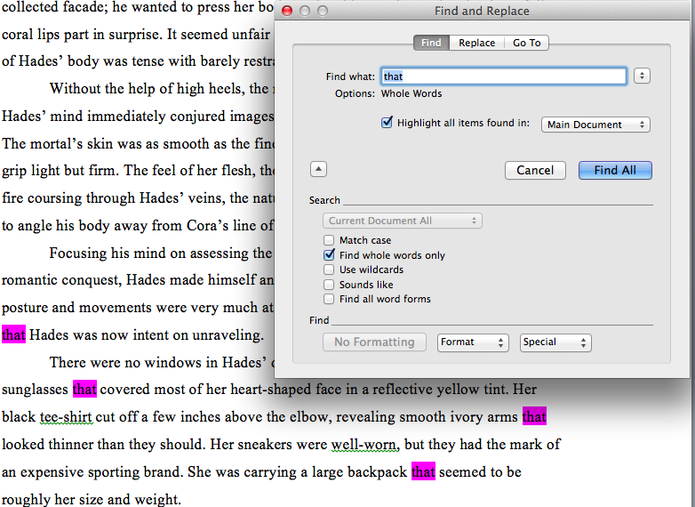
4. Word Addiction: I discovered my love affair with the word "that" after my first content edit. Word addiction is something many writers suffer from. There are just certain words we tend to use over and over again. Once I discovered this affliction, I started preempting these edits by using a very simple MS Word feature. Using the find and replace tool, I can set MS Word to identify all instances of the word "that". Once done, I hit the highlighter tool to assign that word a color. I can even use a different color for each word addiction. 

Screen Shot 2014-02-09 at 2.28.29 PM.png

5. Of Tabs and Page Breaks: One of the cardinal sins of manuscript submission (that I was once guilty of as a first-time author) is using a tab to delineate paragraphs instead of a first line indent. A corollary to this crime is having manual page breaks in locations other than the end of chapters. I now know better than to commit this faux pas, but if I ever want to resurrect a trunked manuscript, MS Word makes searching for tabs and page breaks a breeze. All I have to do is use the Find tool and search for "^t" (tab) or "^m" (page break). 

Comment

Layla Tarar

Globetrotter, lover of languages, and romance author, Tara Quan has an addiction for crafting tales with a pinch of spice and a smidgen of kink. Inspired by her travels, she enjoys tossing her kick-ass heroines and alpha males into exotic contemporary locales, fantasy worlds, and post-apocalyptic futures. Visit Tara at www.taraquan.com

Permalink

Techie Writer Reviews - 5 Reasons I Still Use Storyist

I began my writing journey a little over a year ago (Tower in the Woods was published January 2013). At around the same time, I wrote my initial review of Storyist. I didn't find it perfect then, and it isn't perfect now. Nonetheless, I've used it to write 5 books (6 if you count the one pending revisions), and I'm about to use it for my 7th. Below are 5 reasons why.

1. Full Screen Mode

When the weather is nice, I like to write on my balcony. While sunshine does wonders for creativity, it creates serious glare. Storyist lets me choose the background and text color in full screen which comes in really handy for (a) creating a retro/DOS feel (b) reducing eyestrain, and (c) conserving battery life. 

storyboard

2. Character Board

One fun pre-draft activity I indulge in is casting characters. Not only does it give me an excuse to ogle images of Aleksandr Skarsgard ("This is research, honey!"), it makes filling out cover-art questionnaires a breeze and keeps me honest when writing sequels. Storyist not only lets me import pictures into it's character (and settings) board, it also prompts me to fill out some forms prior to starting. In other words, the software helps curb my "pantsing" tendencies.  

Screen Shot 2014-02-02 at 5.47.25 PM.png

3. Modular Chapters and Scenes (aka Blocking)

When I first wrote my newest release, Catching Red, I decided to be all artsy and went with a non-linear story, replete with flashbacks and dream sequences. After a harsh reality check (aka. revise and resubmit), I embraced the simplicity of a single timeline. Rewriting the book would have been much more difficult had I not been able to drag and drop chapters and scenes at will. 

Screen Shot 2014-02-02 at 5.53.36 PM.png

4. Word Counter and Timer

I work better under pressure, even when it's self-created. I also have this tendency of forgetting mundane necessities like eating lunch and going to the bathroom. As such, I utilize Storyist to set session goals before I start writing. As I type, Storyist keeps tabs on how many words (and/or minutes) I have left before I can take a break. If you remember, one of my gripes was the fact that this inspector isn't integrated into full screen mode (as is the case with Story Mill). However, I've gotten accustomed to leaving this tool closed and simply waiting for the hero chime to signal my reprieve.

Screen Shot 2014-02-02 at 6.11.46 PM.png

5. Smart Typography and Style Inspector

Different publishers have different submission requirements and house styles, and it behooves an author to make sure their manuscripts adhere to these guidelines. But I don't always know where I'll submit my story, and every rejection means another round of changes. Storyist's smart typography converter and style inspector makes reformatting a breeze (even when it comes to nitty gritty stuff like ellipses and em-dashes).

And thus I conclude this edition of Techie Writer ReviewsComments and questions are always welcome.